
Carely
Tackling Health Insurance Literacy In Young Adults
Background
Problem:
Young adults struggle with understanding health insurance options due to complex terms, limited literacy, and poor support systems.

 |
|---|
 |
 |
 |
 |
 |
Carely is web-based solution designed to bridge the health insurance literacy gap for young adults transitioning off parental plans.
Solution:

Carely
Features include educational resources, plan comparison tools, and AI assistance.
Its goal is to empower young adults with the knowledge and tools to navigate complex health insurance systems confidently.
Research
Target Audience and Personas
Our target audience is diverse and not limited to the traditional 18–26 age range often associated with health insurance transitions.
While young adults aging out of their parents' plans are a significant focus, our solution extends to individuals across varying life stages who face challenges understanding and managing health insurance.
Persona 1 - Learnin' Lisa

Lisa currently doesn’t have a health insurance plan. She hasn't obtained one yet because she feels it’s too expensive. However, she realizes that she really needs coverage, but finds navigating existing websites challenging. This is her journey as she navigates the NY State of Health marketplace, trying to find a suitable plan.

Persona 2 - Comparin' Chris

Chris just finished work and realizes he needs new health insurance for his changing needs. Used to employer-provided coverage, he feels lost. Chris goes online, hoping to find a clear option on the first sponsored insurance marketplace service.

Information Architecture
The framework of the web application is simple and direct.
Our team decided on the simple structure to make sure that our intended users are given their desired outcome as effectively and efficiently as possible, without leaving room.

Our service is built to integrate seamlessly into any healthcare platform, whether it’s a major insurer like United Healthcare, a state health insurance marketplace, or a telehealth provider. Its adaptable design ensures smooth implementation while creating an engaging, simple, and accessible user experience.
Interaction Models
We then focused on the main tasks our personas needed to complete and created an Interaction Model for each

Learning Terms
Insurance Evaluation

Initial Sketches / Low Fidelity Wireframes


The barebones first iteration proved to be successful after having tested it on our 3 target users, who could practically be our personas!
We now had some feedback to work off of for our next iteration:
Figure out colors to provide a happy and healthy appearance
Create a design that is extremely easy to utilize (child-toy-esque)
Introduce questions so they do not disrupt the flow of the story
Introduce questions so they do not disrupt the flow of the story
Mid-Fidelity Prototype
This design stage meant creating digital variants of our previous ideation. Seeing the structure digitally helped visualize how the new design functions

User Testing
& Refinement
2 Group Testing
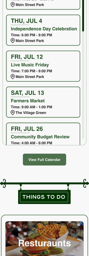
In our tests, we asked people to find the water bill payment section as well as an event's info using both the old and new designs.
-
They pointed out where they’d click, or interacted w/prototype directly
-
We timed how long it took them for both the current site and prototype
-
There was no feedback guiding them in the right direction, they were on their own if they selected an un-prototyped component.
This let us see how efficient the new design was compared to the old one, and the results were pretty successful.
High-Fidelity Prototypes
Our interaction-model-focused mid-fidelity prototypes were a success, so we decided to create higher quality variants with Village branding and colors.
Click this button to check it out!
Takeaways
Once completed, we had the participants share their thoughts on the other content and layout of information.
Here's a quick list of suggested focus points for future iterations.
-
Improved button icon clarity for better mapping
-
Consider header navigation restructuring with feedback from admins
-
Get feedback from authorities and emergency services
-
Adjusted the online payment process to utilize api functionality in-site
Reflection & Future Work
Reflection
On feedback: We focused heavily on designing for the end users, and while we succeeded in making navigation more intuitive, we have yet to gather input from administrative staff to understand how the updates impact their workflows. Their feedback will be critical for the next phase of improvement.
On accessibility: Due to time constraints, we prioritized creating an accessible experience based on user needs, but we haven’t yet confirmed full compliance with Section 508 or ADA standards. This remains a necessary step to ensure the redesign is fully inclusive.
On design systems: Incorporating the United States Web Design System wasn’t part of our initial scope, but its potential to create consistency and accessibility, it’s something we’ll need to explore moving forward.
Future Work
-
Conduct interviews and usability testing with administrative staff to evaluate the effectiveness of the new design from their perspective.
-
Integrate the USWDS Design System to ensure consistency with federal and government standards.
-
Perform a comprehensive accessibility audit to confirm compliance with Section 508 and ADA standards.
-
Expand the design to address additional interaction models and explore new features based on user and admin feedback.
Thank You!
Thank you for taking the time to explore our project! We’re proud of the progress we’ve made and excited about the possibilities for future improvements. Your support and interest mean a lot to us as we work toward creating a better, more accessible experience for everyone.
This 12 week challenge really was just that. Working while having life tackle us in many different ways as we got through each week was something I look forward to experiencing again soon!


